
Our corporate identity gets a new look and tells us about the encounter between continuity and innovation, expressing and affirming QBerg’s identity after 15 years of research and thrilling challenges. It gives voice and body, with strength and coherence, to a nowadays mature company founded on values that are indistinguishable from its own identity.
The new communication project was conveyed thanks to a teaser campaign on our social networks (Linkedin and Twitter) which started on Monday May 10th in a crescendo of video images that culminated today with the official launch of the logo, pay-off and website. Social media marketing activity amplified by a targeted media relations strategy.
The creative and strategic direction of the entire project was coordinated by QBerg’s Marketing division and the MARTIN CASTRO Studio, set up in 1995 by Martin Castro and made up of a group of creative people, graphic and web designers who deal with communication and design at 360°. “The most important aspect of design is to give strength and resonance to communication, i.e. to offer a richness of tone that enhances the expressive power of the final message. This is the colour of the idea devised for QBerg,” says Martin.
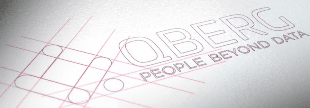
At the heart of the project are the logo and the pay-off ‘People beyond data’, where we begin our journey. The logo represents our need to evolve, with an eye on continuity, enclosed in the letter ‘Q’, which goes from being a simple initial to QBerg’s icon. The colours remain purple and green, but with bolder tones, while the choice for the new font is geared towards decidedly more rounded and soft shapes. The innovation makes the logotype vibrate, and become clear, solid and linear.
Looking at the pay off, we can say that it was born out of the need to underline the importance and value of the QBerg team, made up of individuals who together make a team. The real added value of our company is the people, beyond simple data and business tools.

The real evolution is in the hands of our team, which represents the driving force behind all our projects. With this in mind, a few months ago, we held a an internal contest, in which all our employees participated, and, after days processing the proposals, the declared winner was ‘People beyond data’, because it was exactly what perfectly encapsulated the identity of QBerg.

The project also includes the restyling of the qberg.com website, which we developed with an eye to ease of use, immediacy of information and insights that are relevant to industry and retail. Inside, we want to tell our world, our activities and the challenges of our sector in an innovative and always up-to-date way, with a new graphic look that refers to internationality and dynamism in a container where the elegant black and white predominate contrast is provided by the QBerg’s colours. The structure of the new site is fluid and intuitive, making the consultation of our services immediate.
‘I can safely say that the restyling of QBerg’s image is the result of a maturation. More than 15 years of activity have allowed us to understand which our strengths are, which our values are and therefore which are the factors that contribute to our uniqueness. We have tried to communicate them through our new image: in the spirit of continuity, but with an emphasis on people. Because being a research institute means being much more than just data or software’ underlines Fabrizio Pavone, Business Development and Marketing Manager of QBerg.
We, too, are Qberg!